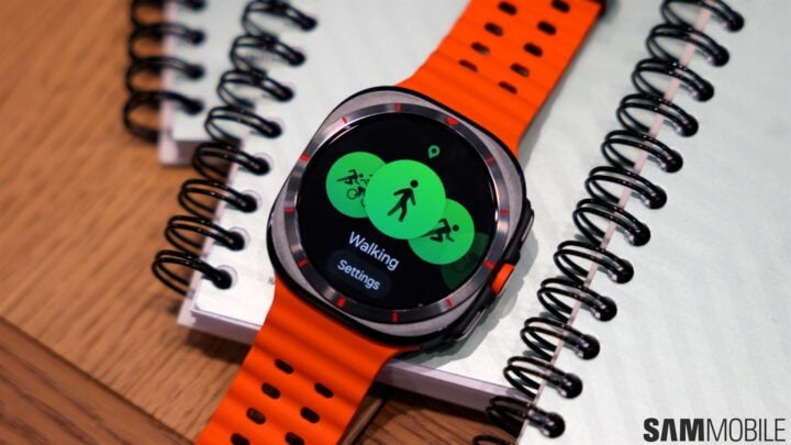
Riddle me this. Why has Samsung used orange to define its latest wearable devices, especially the Galaxy Watch Ultra? Some said it’s because the company copied Apple and that the orange color makes Samsung’s Ultra smartwatch look even more like the Apple Watch Ultra. But we know for a fact that the story runs deeper than that.
Let’s rewind briefly to Galaxy Unpacked 2024. Around the time Samsung unveiled its latest foldable and wearable devices, members of SamMobile attended a briefing where Samsung shared every bit of useful information possible.
When it came down to the choice of colors for its latest wearables, orange stood out. And for a good reason. Samsung gave us a sneak peek into the design process and why the design team decided to add that splash of orange to its latest wearables.
Riddle time is over. First things first, this isn’t just any orange hue. Samsung told us it’s a special hue called Safety Orange. No, Apple didn’t invent it, and in fact, you might be more familiar with it than you think.
Safety Orange is a high-visibility color that pops and sets objects apart from their surroundings. It’s well-documented and used across the world for safety and hunting equipment, at construction sites, and more. You may have also seen Safety Orange on traffic cones and warning signs, as well as the barrel tips of replica guns.
The color goes by other names such as Blaze Orange, Vivid Orange, Hunter Orange, OSHA Orange, and Caltrans Orange.
Simply put, Samsung chose Safety Orange because the color stands out – literally. And needless to say, the company wanted its new Galaxy wearables to stand out, too.
Now the splash of blue makes a lot more sense
Sharp eyes may have also noticed that, aside from Safety Orange, some of Samsung’s latest wearables use a splash of blue. For example, the Galaxy Watch FE and Galaxy Watch 7 wristbands have small patches of blue and orange near the lugs.
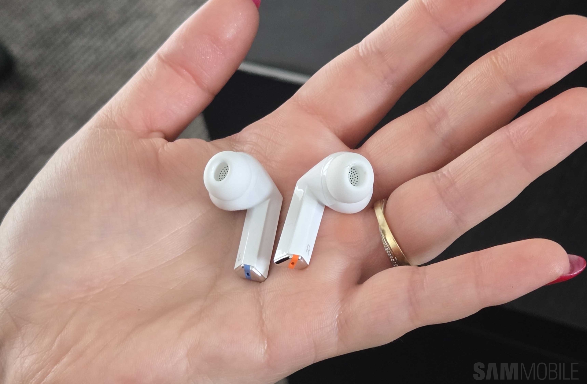
Likewise, the Galaxy Buds 3 and Buds 3 Pro (and their charging cases) use the same two colors to cleverly differentiate between the left and right earbuds.
Why did Samsung pick blue, or more accurately, Azure? It all goes back to that original choice of Safety Orange. Azure is the complementary color of orange, and it’s one of the reasons why Safety Orange even exists, i.e., it creates a nice contrast with the Azure color of the sky, which is prevalent outdoors.
The story continues after the video
So, there you have it. According to the design story Samsung shared with us at Unpacked 2024, its latest wearables use Safety Orange because the color stands out. We can then deduce that Samsung used small patches of Azure in some cases because the color contrasts with orange, thus making the latter pop even more.
Whether Samsung took inspiration from Apple doesn’t really matter. Samsung appears to have had its own thought process and design story for the new wearable devices. Besides, orange is almost universal, and Samsung and Apple weren’t the first watch makers to use this color. Who hasn’t seen a bright orange Casio G-Shock?


